Monday 30 January 2012

WEAVE start of week2

First day of week two in weave and I'm enjoying it again. I did two weaves today of a purple and yellow, then an orange one. Both with drawing on the warp of the weave!


These two photos above are of a purple and yellow weave I did today which I think is alright, the purple colour is abit rugla but its okay, I like the yellow colour the best really. But I liek the drawing Ive done on the warp I'm pleased with that much.


This orange weave I like which I did today, I really like the different franking stamp I did on the warp, I think its really cool! The colours are nice in this, it really does look like a stamp this one I think! I'm pleased!

Lecture- Cathedrals of Consumption

Shopping, Women and the City                   27.1.12

The Flaneur is a gentleman stroller who walks the streets and aracades of the city looking in shop windows, other people in the streets stare at him. The Flaneur is mentioned in many writings, in books. However there is no mention of a female flaneur, a flanette. Women werent excluded from partcipation in the modern city they were just excluded from the texts which represented it. They had to be chaperoned if they were to walk the streets by their husband, brother or father, otherwise a lady not accominied by a chaperone was labeled a prostitute. Working class women walked alone, this you could tell by their clothes if they were a washer women or had a job in that area. Ballet dancers walked alone and this was classified as working clas, however nowadays they are classified as dancers who are immensly talented and treated with respect. Womens pressence in the 19th century could be uncompanied by their chaperone if they were going to a teadroom, gallery or museum these were public places seemed decent enough for upper class women alone.

Nowadays urban life has a fixed price tae, you used to be able to just go into the city and window shop, become a flaneur, but nowadays you cant not spend money, whether its on a train fare a bottle of water. Citys nowadays arent places to stand and look or talk, they are all about movement, there arent many places to sit in coffee shops as your not ment to, its a quick coffee or lunch then on the move again. When the department store came along citys became part of consumption not a place to make things anymore. By the end of the 19th century most cities had a department store, and these were used for rational as they were moving forwards. They are now also or entertainment, exhibtions, museums cinemas.
The first french department store was called the Bon Marche and it opened in 1850, it was the first time shoppers could walk around and browse it became fun. Consumption was becoming easier to do, its now even more easier in the 21st century as you can stay inside and do it all on your computer.
There was a difference between a fancy goods store and a department store as the fancy goods store wasnt as high a quailty as the department store is. A fancy goods store there were no foxed prices, as you were given a price on the way you looked, so if an upper class household sent their maid they would it at a cheaper price.
The department store had a returns policy so the women would buy all these goods and show their husbands who would say its to much money the wife would say theres a returns policy, but the husband would rather the goods then the embarresment of returning as the returns deask woudl be in the middle of the store and eveyone would see as these days a department store was every open with glass pannels, two floors with balconeys so you could see what other women were buying and spending, so everyone would be able to see if you were returning goods and this was humiliation. The peolpe behind the returns desk were men and they would be rude to the women about returning goods and make them feel small. All of this was a poly to make them keep the item, it was easier to keep it then return the goods, this was consumption by the department store. The departement stores were built in circles, so everyone could see you, so you werent sure if you were being spyed on or not. It was a panoctium, there were guards looking at you, like there are sucurity men in the 21st century.
Rationalisation was happening to citys as they were expanding, they were being rebuilt bit by bit, side walks were getting bigger so it ment the shop windows were getting bigger so peolpe could stop and look and see what was infront of them. Peolpe looked for a long time as it gave them the feeling that they had actually bought the goods by looking at them so much in such depth because the windows were so big. Department stores where all about getting everything and anything in a shop window to make to the store look very grand, it was showing modernity showing what they could make and that life was getting better. The rationalism of citys ebign rebulit made them become on a grid system of streets and roads, which made it easier for everyone to get around and it made it easier of women to egt to the shops and you could find your way easily.
Cystyal palace was a department store on a grand level, it was in the city yet everything to make the palace was made around the country, the steel the glass and it was brought to the sity like flat pack to be made. Cystal palace was very grand with open spaces, fabric drapped over the balconeys, it had a glass roof so light could come in, it was a very feminine space.
Transport was becoming better, we were designing ocean liners with class as they had the grand stairways and balconeys with drapped fabric like the department stores did, titantic was one of these. Chandielers, carpets wooden floors, it oozed luxjaurity.
Women were wearing crinilin cages underneath their dresses to make them have these big posh looking skirts and corests which wer very uncomfortable so there were velvet sofas they could rest on. Department stores had toliets for women to use, so it ment they coul spend the whole day shopping without having the need to go home, they could refeshen up whilest shopping.
The department stores couldnt have working class girls working on the shop floors, it gave the wrong impression, so they ahd to have middle class women but not married ones either. However it was difficult as middle class girls couldnt get the train in on their own, so they would live in the department store. A lot of deaths happened here due to the stores having a lot of lighting with oil lamps, a lot of fires happened so a lot of deaths occured. If you were a gay women working in the department store was a good job as it wouldnt be suspected that you were gay due to the place you worked, so you could slip under the radar. Men started to worry about their wives shopping so much because of frotteurs, who were men who rubbed themselves against women, but actually they would be rubbing against the crinilin cages.
Men think they own the city and dont want women taking over so to do their shopping they had their own entrances to the department stores, their own shop assistents, so they could be serperate to women. Women were told not to travel to shop in rush over as men didnt want to be around women with shopping bags and talking about fashion and furnishings.
Brent cross was out first out of town shopping mall built in 1976, a concept imported from america. These were covered by roofs with no light, so you couldnt know what time of day it was so you could shop all day without realising. Shopping nowadays is more then just spending money its the thought of getting a bit of culture too but the status and marble floors malls have nowadays.
Women could get away with theft by the fact they were women, they were seen as weak so woudlnt steal.

Seminar 2

The media dont tell you the full story, they crop out half the image and dont tell you whats happening to the right hand side of the amry soldiers. It all depended what TV chanell you were watching whether the amry were heros or muderers? Context is always neccassery for image analyse.
Media images never tell you the truth, whether its airbrush or the photos been cropped. But how often do we question an image? Rarely.
Perspection changes through images and through the years also, as style changes so the images change also. Commerical images are expensive to make so if its in the image its there for a reason.
Richard Dyer says that representation is culture, specfic representations are presentations.
The media tells the truth as this is what this culture agrees with as they went through advertising analysis to show this so its culturely acceptable.
Seminar 2

Sunday 29 January 2012

WEAVE end of week1

I have really enjoyed weave this week, its been brilliant. Its the process I love, its like being on the sewing machince and it gets addictive and I love it, its been a really good week. I have done quite a few samples. Take a look below.


I really like the pink one I think the colours are really nice, they represent the stamp colours very well, and it looks very nice which is what the patteren on the stamp is.


The green weave I tired something new to try and have two fabrics going at the same time, which I think I have achieved, also the different green tones, represent the stamp well also.


This brown weave, I used smaller threads, so its a lot neater and almost strict. Its okay this one, it deffinately reflects the stamp. These three weaves above the pink, green and brown are me representing the colours of the stamps and the lines, the stright block lines, the thickness of that section of weave is to show the same thickness of the stamp.

I have tired something new now, instead of just doign block colour to show the stamp, I've tired to replica the stamp in the patteren, and the words. Below is a photo.


Here I have drawn the franking that is on the stamp onto the wrap of the loom. I draw it on with a black marker. I then did my weave using light blue colours to represent the stamp and this I think has worked really well, the colours the weave patteren has worked really well with the old fashioned feel of the stamp coming through. This is my favourite weave so far. The fact that you can quite clearly see its the franking of a stamp I'm really pleased with. I did this one yesterday, when I went in on Saturday to get an extra weave done.
I'm really looking forward to this week now!

Lecture- Exoticism in Design

Orientalism in Fashion             25.1.11

There are two types of orientalism, the first is the use of orientation patterens and the second is the culture cuts. In 1842 we, britain, defeats china in the opium war.
Vincent Van Gogh has the influence of Japanse art in his work, his self portrait with the bandage around his head in 1889 had  Japanese print in the background. He said 'All my work is founded on Japanse Art..... Japanese art decadent in its own country, takes root again among the French Impressionist artists', Gogh 1887, he wrote this in a letter. He is saying Japanese know how to do there own art, the French can do it better.
In the 1800's europeans saw middle eatern cultures as defined ny Orientalism.
'Orientalism is not a picture of the East or the Easts. It represents longing, option and faraway perfection', Richard Martin, 1995.

Lecture- Trade between East and West

Textiles and worldwide Trade, 1600-1900                      18.11.11

Typical things we thought were english turn out to have a rather different background. British tea in china mugs, chintz curtains all imported from China so its not very british yet its made to think its a british past time. Without Indian Textiles , British textiles would be very different today and it may not even exist if it wasnt for them. A quote, 'Where is wisdom to be found, and where is the place of understanding'. Importers where looking for things better then wisdom to bring back with them, they found gold, silver and Indian Textiles. However it had to the be the current fashion in Indian cloth, if the importer was late getting the island to collect his shipping, whethe rit was due to wind or rough seas, if he was late then the good textiles, the textiles with the current cloth, material the current patterens and colours would have gone and he would have to find replacements of the same high standards as otherwise the companies back in Britain would realize its a different material even if the colours look the same and not accept it. This was bad then the importer couldnt pay his shipping bills all because he wasnt in time to collect the highest quailty material.
The term Chintz we have grown to understand is a word for a patteren thats on carpets and sofas,but actually its a printing technique. The Japenesse word for 'Chintz' is 'Sarasa'. In the 1620's Chintz was very popular in england as a patteren for dress and furnishing fabrics. 50,000 pieces of Chintz, huge pieces, were imported to england, it was very popular with the middle class as they could afford it.
However in 1700 there was a ban on the sale of chintz in england, then in 1720 there was a ban on the use of chintz, as britain wanted peolpe to only use wool as it was british and not imported fabric. Then in 1742 as new technique was developed in england called 'China Blue', it was a very expensive and complex technique.
In 1800 it all changed again as 'neoclassical' styles of dress and interiors based on acient greece and rome became very fashionable in europe. A new fashion was that peolpe wore white dresses, with no selves in winter in france, for this you needed indian textiles as it was the best muslin you could find.
In 1800 britian overtakes india as major world exporter of printed cotton and cloth, as we had a huge cotton factory in Manchester.
The paisley patteren is actually called botwe and is from india.

VISIT TO THE V&A

We went to go and visit the V&A to look to look at indian and other textiles. There were alot of chintz patterens which looked very british with the light colours, Clare made us guess if they were bristish or not as they all turned out to be Japenesse. If you looked at it after you knew it was clear that it is actually international textiles and not british. We looked at other textiles, mainly indian textiles and the patterens. We also looked at tippoos tiger, which was a toy made for the prince in indian, which was a musical intrusment and it even roared like a tiger would. It was fasincating.

Blythe House

Just before Christmas we had a visit to Blythe House and it was incredible. You arrive at this place and I expected a an old post office building as thats what Clare said it was, but it was like a prison. The metal gates you go through to get in, then the way you have to sign yourself in, the corridors you pass with the big metal doors and locks its so secure and strict. However when we finally sat down for the talk it was amazing. In 1978 the Bylthe House collection started and its an archive of work of a business or a person, but its not just a few pieces from the collection by this peson or company, buts the whole thing, not just the best pieces, the whole collection. There are in total 350 collections at Bylthe house. With this in mind I know understand why its so strict in this process, everything is weighed out before you can see it then its weighed when it goes back into storeage, this is how strict and percise this place is. Its brilliant that such care goes into it.
The pieces that they had got out for us were incredible, they had a fabric sample book from Heals, which was showing the fashion trends for that years Spring/Summer or A/W, but rather then having photos, drawings were done, actual fabric swatches were put in showing the thickness, the texture, how the colour would actually look, but it would also tell you how much the fabric costs in the quanity also. There were colour charts as well you could follow for when you went shopping to by these trends. I thought it was magnifient really was, you dont get fashion catologues like that anymore nowdays it only shows you photos of what it would look like sitting by a pool in the sunlight not actually just sitting behind a desk doing work. There were books showing fabric swatches as well that companys could make for you on commission, whether plain fabric, fabric with a stripe, or at the back of the book there were fabric swathes with deer print on (bambi), flowers cherrys printed on rather like the Cath Kidston of today.
There was work by Gordon Hunten, Barbara Golan, so many pieces, and these were just a selection for us, so goodness knows how many more they would have had.
It was an incredible visit and it was too short an hour and a half juts isnt enough, it was amazing.
You are allowed to take photos, but my camera got swiped of its memory so I lost mine unfortunately. It was a really good insight into what they have, and it would be amazing to go again and actually see things that would have a current project, not just because its amazing and you could spend the whole day pouring through fabric swatches.

Rough Guide Theory Task

Exploring Covent Garden, Soho and China Town was an exciting task as I have been to these places many times, but never really looked fully into these areas.
China Town on a weekday is quite busy, tourists taking photos, locals running their food shops, some had little markets on the front of their shops. One shop was selling a strange looking fruit or vegetable, large in size bigger then a football, covered in spikes, but not harmful spikes. On closer inspection, it looked like a bigger lychee fruit, with a hard skin but soft flesh. A lady brought half a fruit and when it was cut into it turned out to have a yellow centre, with large stones. They said it can be eaten ripe when its uncooked or unripe when its is cooked. This made no sense to me so I did my research and its known as a meat for the vegetarian, used in curry’s as a meat substitute. It’s called a Thai Jackfruit, from the name you wouldn’t think it would have any association with China, it doesn’t it originates from Southern and Southeast Asia. So why its sitting in China town passing itself off as a Chinese fruit I’m not sure, if it was in a normal supermarket you wouldn’t know where its from and you wouldn’t question it. With its strange properties in skin, size and being yellow in colour, it fits in with the bright colours and other different foods in the Chinese food stores so it’s a fascinating object or piece of fruit. I wish there had been no language barrier to have found out more about this interesting food and to have maybe tired some. They weren’t buying much of this fruit, taking a slice then covering it in cling film, so maybe the Chinese use this fruit for different things to what they do in Asia?

You move to a completing different culture when you walk over to Covent Garden, the people have a different attitude towards you, being the person, drawing your surroundings. There was a little open door with a little paper theatre set in the doorway. It was in a glass case, so it felt like it was fragile and special to someone, that it meant something? Walking up the staircase you don’t know what to expect, but a toy shop is not one of them. It was full of everything a little boy would dream off. Crammed full of puzzles, joke books, diabolos, puppets and at the back of this shop were more paper theatres. A large one with a stage which had characters on you could move with sliders on the side, it had stalls on the side of the stage, with mini characters inside also. They were pristine in shape, little cut-out figures. The colours of these were incredible also, different colours for each stage, one red, yellow and gold, another blue silver and white. There were signs saying, do not touch fragile, but all you want to do is play with them, its like a grown up dolls house. A girls face on her birthday being given one of these, you wouldn’t know what to do, play or just stare at it. It sets Covent Garden very well, being that there are performers outside the window of this toy shop, acting, telling jokes, jumping through hoops to entertain the crowd and this is what these theatre sets are doing too. Its an atmosphere here of fun, laughter and enjoyment. The huge bowls of paella that also sit outside this shops door are injected with colour of the yellow rice, pink prawns, green peppers like the reds, yellows and gold’s in the theatre sets which just make it feel magic. It’s a completely different feel to China Town yet they are so close together and are both full of people and noise yet worlds apart.

Soho is a mixture of Covent Garden but with added cool, sex shops yes, but also lined with fabric shops that are growing into the street as well enticing you in. Stalls selling food, wraps, toasted nuts covered in sugar, spice and all things nice. Corner shops selling the most amazing magazines under the sun, you could buy them all and not know where to start they are incredible. But then I walked past this little gallery called The Riflemarker, which I’ve been to before and unfortunately it wasn’t open this time. Last time I went in there were three levels, the ground floor with pictures in, the first floor you get to by walking up a thin winding ladder that looks like its about to break, the floor boards creak, then there’s the lower ground. In it were two panels of magnetic metal or something, which each had around 30 little squares on it, all in different colours, slowing changing colour and they were magnetic so you could move them around. There was a little remote on the boards, and if you pressed the button they all changed colour automatically then continued in their cycle of changing. It was slightly like a jellyfish pulsing colour through its veins. One amazing thing we found out was if I put my hand on a green square, and my Dad had his hand on an orange square, if we then held hands, with our other hand still on the squares they would somehow connect and my Dads square would suddenly change to green. This was amazing, it was like an electric connection was happening between us and the squares, the same thing happened again between a blue and a red square one of the squares turned red. This little gallery on a side street in Soho held this amazing piece of artwork and it fitted in brilliantly in its surroundings, if it was placed in the National Gallery it wouldn’t fit in so well, that’s what’s great about these little unknown galleries they hold treasures and if everybody knew it wouldn’t be the same.

These three places, so close together yet worlds apart all hold different things which make them unique, whether it be a fruit, a paper theatre set or a little gallery but they all suit their homes were I found them, they belong in the right place. Exploring these places was a great experience, there is still loads to be found but that’s the beauty of it, its always changing so you never will explore it all.


Thai Jackfruit


Paper Theatre Set


Art work in The Riflemaker

Tuesday 24 January 2012

Lecture- And then there was stuff...

We had out first lecture by Emmanuelle Dirix on friday and it was incredible. We are going to have about 6 lectures by her based on Globalisation and Consumption and this first one was brilliant. First thing we had to do was after meeting Emmanuelle for 5mins and less was judge her on what we have just seen, say what music she listens to, where she lives, her lifestyle basically, was really hard. We then said we found and thought in the seminar after the lecture, I'll write about that after.
A lot of the lecture was about how we automatically judge a person on their apearence and culture, a modern way of this is Facebook, is a way a person can show of on what their lifestyle is whether its money, clothes, family, career. We also discussed how this happenend in the industrial revolution. The industrail revolution had two faces. It was system called the Cottage System in which a family would run a business at home, weaving fibres a family run buissness almost. Nowadays is a harsh business as you have to factor in aspects you didnt used to have too, the weather is a factor now as this seasons knitwear is still on the shevelves as its been to hot to wear jumpers and knits. Social anxiety has always been an issue within our race as we judge on everything, Charles Dickens picked up on this as in his books he documents what social classes are wearing. In the 1700's its wasnt as such a bigger issue if you didnt have the lastest fashion pieces you could close the door behind you or if you had the money you could and have the lastest hand printed fabric made for you, whereas in todays culture you cant escape vanity as its all over facebook and if you dont have it your made to feel down. Its all about consumption its what the companies want to happen, its all about the food we eat, the music we listen to, consumption is always there so we always judge. The 19th Centurary was the same as today, the lastest fashion publications (Vouge) was there to inform but also had the best trends in fashion patterens women could read about whilest the men read the paper.
Volume consumption existed in the first face of the industrial revolution, in the way that, more is more making you fill a room with fabrics, books china, showing off that you had the money, the more things you crammed in the room the better as it made you look rich and a better class to your friends.
The second face was much different in the way that peolpe were struggling, factories were growing in the outskirts of cities which meant the cottage system was failing, so familys move to get jobs in the factories, but less jobs were going as machines do the jobs for you. The main employee were women as they were cheaper and the bosses feel empowered by using them for other things also. Having women work for you also meant that they brought their children into work and this meant little peolple were working so they could get under the machines if something broke to fix it, this still happens nowadays children working and getting killed so then there is the moral question in do you know who our clothes are being made? Some companies ran a cottage system in the cities, women were working at home which is good as they can look after their children and also the children can help with the work load, then someone came to collect the work produced, with this also rape occured as it was in their home enviroment so it could happen without many peolpe knowing.  Karl Marx recongised this as fragmantation of labour as workers were at the mercy of their bosses. This also encourages exploration as there was on security for this not to happen. Marx notes that luxary goods are produced on slave labour. However Marx is obessessed with production he forgets about consumption.
Part of consumption is that we use of eyes and not common sense, if a product looks off then we bin it and dont bother to actually check if its gone out of date, this is good for consumption as we buy more.
Material goods were meant to be just for the upper class, however they started to catch up and had material goods and slightly better looking clothing. This made the upper class need something more, so they took on etiquette to take them into a different league to the middle class.
Consumption was taken into a new league when inventing new markets became fashionable. The 'Family mourning market' was introduced and it made death become fashionable int he sense that the more money you spent on the deceased its shows how much you loved them. You had to have everything to show you cared, everything in black, black pearls, black dresses, black letters, black cloth, and this meant more consumption.
The consumer culture shows we have been spending more time and money on sonsumer activites since at least the 18th Centuray. Barbara Kruger shows this in her advert 'I shop therefore I am'.
the 20th Centuray shows unprecedented development of consumer culture and the values of consumerism, the increase of peolpes spending power, new technologies, credit cards which make buying something so easy so we just have to do it. Also the growing role of advertising and the development of new promotional techniques.
The lyrics in Lilly Allens song are relevent here as it shows consumerism, 'I am a weapon of massive consumption. And its not my fault its how I'm programmed to function'. This shows the 21st Century in its true colours.


First SEMINAR- fashion as lanuage.
We discussed how clothing is more then just fabric draped over the body it makes people judge us, and thats what we did in the first 5 minutes of the lecture judge her by her clothes, whereas in three other photos she showed us we would have said completely different things. Our clothes express our personality but also a group personality also.

It was a really good first lecture and seminar!

WEAVEday2

Second day of weave and I'm really enjoying it! This morning I just had a go at trying out different techniques and styles again, just trying to get the hang of it all! It took a little while but then I got into the swing of it again, its good! I only did one weave this today as the other group was on the looms this afternoon. Below are pictures of it!


The patterens I did today were Triangular Granite (the mustard), Common Twill (the red) and Entwining Twill (the blue). I was trying to make them look like stamps, with an old feel and the scalloped edges that stamps have, it kinda worked.

I had a tutorial with Helen today and she gave me some ideas for this project on the looms, she said maybe draw on the warp some of the franking stamps that are on the stamps in my grannies collection. This I thought a really good idea, if I draw on the warp in a thick black line, then weave on top it could have a really good effect.
She also said if I were to scan in the images of some of the stamps, and zoom in on them I will get a better view of the patterens on the edges of the stamps and I could maybe try some of these out in the small hand weave samples. This sounds really good I cant wait.
I need to finalize my colour pallette also, but I'm going to see what yarns are in the yarn store tomorrow in our induction, hopefully this will help me!
SCANING TIME!!!

Monday 23 January 2012

SWATCH book

So after alot of thought about this swatch book project I have finally started it. Took me a while to start thinking about what swatches I wanted to put in it and how I was going to display them. It sounds pathetic now, but I've stapled them into a little sketch book, to keep them safe and in a similiar way of presenting. The first swatches I have put in are from my work experinece I did over the summer last year, I worked for Jacqui Gilmartin who is a digital printer, I helped steam the prints, wash them in about 5 different ways, but I also made swatch books for her in the many different materials she prints in. So I had scraps from doing this and I have put them in the begining of my swatch book. They are plain white as they would then be printed onto. They are in weight order like I had to put them in for the swatch books for Jacqui, the Silk samples go first then the Cotton ones.
Then in my swatch book I have started to put different fabrics in which I have collected or manipulated myself over the years. There is no patteren for this just stapled them in.

This is an on going project swatch book, so I'll keep updating this post page with more details on my swatch book.

WEAVEday1

First day of weave today and I was a bit apprehensive about it, only because the work I have seen from other peolpe is really intricate and they made it sound really tricky and fiddlely and I struggle in that department. However I found that I really enjoyed it actually, was really good, its a new skill which I have learnt and I'm pleased about that! Its a slow process but I found the time went quickly so it didnt bother me!
We learnt how to get patterens, by following a graph of dark and light squares, and those match up with the leavers on the loom. It sounds complicated but something just clicks and its quite easy actually!

This photo below is what my loom looked liked before lunch today. I was working with Sian and we produced quite a bit! My favourite is the the mustard colour one I made, its called 'Triangular Granite' and it looks like mini windmills. The colours we used worked well also I thought!


After lunch we added these weaves below. We coloured the thread on the warp so we had a coloured background to work on not just a plain thread. This worked really well I thought and am pleased with the experimenting! The top weave on the photo below is a favourite of mine also, its called 'Entwinning Twirl' and it shows the coloured warp we did! It looks like we used three threads but no we didnt, the warp thread is the white, the dark blue is the weft thread we used and the turquoise is the colour we added on the warp.


I really enjoyed Weave today I learnt alot like I said before, but it felt even though I was on a loom and it may seem like you cant do much with that being stuck on one machince but it felt like there were many possiblities which I'm really excited about! I just hope this excitment carries on for the rest of the two weeks!


Sunday 22 January 2012

PRINT week 2

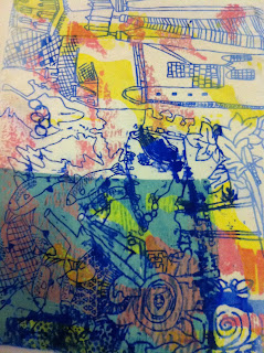
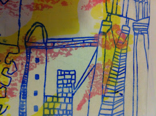
Second week of print and this week was alot more practical, we have been in the print studio all week and its been good but SO tiring! I have enjoyed it but with the way I draw poelpe have been saying that my drawings will make really good prints and this gave me pressure and I felt I had to do well and with this I panicked and am not really happy with the outcome unfortunately.

DAY1. We made out screens which was a really long process. We had to wash our screens, put a layer of cleaning fluid on it then jet wash this off and the last screen comes of the screen, then dry this in the heat cupboard. Next put emullsion on it leave for 30mins. Then we exposed it on the light box, this is a much simpler version i'm writing lots more things inbetween we did! Finally at the end of the day we had our screen ready! We then had a go at doing one print to see if it works, mine was okay I needed to press harder on the squeege to get a better outcome. Some areas of my print came off in the washing process so I had to use tipex to put the stencil back in! See the photos below!


This is a close up of my favourite part of my screen, I love the jumping salmon and the triangles!


DAY2. We learnt how to create pigments today to print with, its quite an easy process and I enjoyed it. You have to make the colour pigment you want and a netural colour then you mix the a little of the pigment with the netural! I did my best two prints on tuesday I love the colour I used and the lines are really crisp and visalbe which I'm really pleased with!


DAY3. Learnt all about pigments and fibres in fabric today, really interesting. Also learnt that there is a crazy incredible tutor in print, maraget. Shes amazing! She taught us all about making dyes to dye fabrics so you have a base to work from. Really interesing. I dyed two pieces of fabric a yellow and a turquoise which is more of a blue now. 

DAY4. Discharge today. Its where you put a liquid on your fabric though your screen and you leave a discharge on the fabric and this basically takes about the dye where it went through the screen. Its like a batik really. So I did the discharge let it dry and then you steam it for 10mins and the discharge appears. I did it on the yellow you can slightly see this, and I did it on the black and this worked out really well! On the yellow one I then printed on top of this and I like the effect of the light colours! 


The white you can see is the discharge working! woop!


I did this print also, I like the colours but unfortunately the blue line is quite lumpy, thick and ugly but oh well. I tired to cover it up with the green but it juts highlights it a bit more!


This print below is my black discharge, it looks like I've bleached it but its a discharge, if I had more time I'd of tired to print on top of it. Also I steamed this for 45mins and it should have only been in for 10mins deary me, which is why its bleed quite abit.


This print below I quite liked but unfortuately when I washed it, it blead loads and I've lost alot of the colour layers I put on it. It had about four layers of colour and you can just about see two, so I dont know what happened, whether it didnt steam properally or something who knows?


Those are my prints I have done this week, I woud have liked to have a lot more but I just didnt have time I felt we didnt have enough time in print to understand it all, get the screen ready and print as well. I didnt manage to get m devore done either as I ran out of time. I did enjoy print and I'm pleased I've learnt all about it and how to do it as I think it will be a very vital skill in my textiles degree! woooo.

Sunday 15 January 2012

block 3- PRINT

So had a lovely christmas and a new year and now am back in LONDON and straight back to the good stuff! PRINT!!! I went in the first group and had a day full of CAD (photoshop) learning all the tricks and trades of how to create interesting prints. I struggled at first but after a whole day of trying to crack it I was doing alright but then it came to the end of the end and I was juts praying that I wouldnt forget everything by Wednesday my next day in the CAD workshop!
Luckily I hadnt! Wednesday was mcuh better because we were able to work on our actual prints rather then learn more about photoshop, just get on with it! We had to scan in our drawings and I also scanned in some of the stamps to add some colour to my work and show what I'm interested in and my project more. So I was playing around with imagery and scale, and remebering all the tools we learnt on monday, and I actually did some good work! I was pleased with myself! We have to do 4-6 designs, so far I've got in motion 4!
I went back to the photoshop studio friday afternoon and did some more work, I've got quite a bit more to do though, because I'm slow on photoshop so it takes me longer then everyone, but I dont mind!
Then me being a good student I thought I'd go in on Saturday and go to the library and do my photoshop work there so I walked in and 10mins from college I realised I forgot my memory stick so I couldnt do any! Annoyed much!!!! But I still have this week to finsih them in my lunch hour and I can go next saturday in stead!!! YAY. So thats the CAD side of print. I think I could get into it, its a good process and I thought I'd find it irrating and to time consuming as I did when I was 14, but I liked it! Dont mind giveing it ago at all!!! Which is a really good time I'm happy!!!

So the actual PRINT side this week we had to draw 6 prints based on our project, mine is stamps! So I have been doing my linear drawings of parts of the stamps. I really like working with the stamps as there is so much information on them there is loads to draw its great!! This doesnt get boring either as I love drawing which is great also!! wooo!! I have been adding pattern and texture in parts of the drawings so the prints next week when we expose them onto the fabric have more detail! The only thing I'm worried about is that they are too detailed and might merge into one maybe? You might not able to see all the detail I have done and there is quite abit!! But you can see what I mean with the photos below!!

Design ONE


Design TWO


Design THREE


Design FOUR


Design FIVE


Design SIX


So those are my six deigns for week two of print. I like them all really so I dont mind which one is chosen to be exposed, but you can see my concern of the line thickness and the detail, I'm hoping it will be okay! Fingers crossed! I've really enjoyed doing the drawing side though, its been great!!!
I think my designs look abit liek the work of Grayson Perry, the composition of my drawings are like his, fully loaded, but its a nice effect having it busy, I think anyway! His look different to mine as his have colour, mine have to be black and white for the exposing next week. If I was doing them for a different reason I'd put block colour in like he has, as its stricking like the bold print is and this works well. 
Below is an image of his I found from the British Museum website as he has an exhibtion on right now, which I plan to go and visit this week after college.


This week had been really interestin and I have enjoyed it much more then I thought I would have done, so I cant wait for next week to get more hands on!!