This morning I handed in my last work for Unit 1 and Unit 2! I have worked so hard and tired so hard in everything with the blocks and the writing side for Unit 1. I feel bare now I ve handed it all in but it feels good, I juts hope it does me proud I hope so!
Anyway new project has been handed out TRANSITION and its to be done in pairs so I'm working with Kaly Aluihare, Big K, as shes known to me and I think it will be a good project, I'm excited to start it and work with her and bring both our brains together for the first time. We were on foundation at chelsea together so I know how she works as does she me so I think it will work well!!! Hopefully!
Anyhow off for a pub lunch now to celebrate!
Tuesday, 7 February 2012
Monday, 6 February 2012
Is it Fine Art or a Craft? Grayson Perry and The Power of Making
Entering the ‘Power of Making’ exhibition you automatically get a sense of craftsmanship, its full to the brim of work which has had a lot of time taken over it, you can see hours of work being poured into all these pieces in this one little space. My favourite was the ‘Heatherwick Studio, snowflake address and Christmas card’, it was a beautiful piece which was handcrafted perfectly and very delicate, the definition of craftsmanship to me. The Grayson Perry exhibition ‘The Tomb of the Unknown Crafts’ shows the same level of hours being spent on the work, but I saw it all as fine art pieces, more extraordinary in the meanings that come from the pieces. With the running theme of a teddy bear called Alan Measles who has a main role throughout the exhibition in pieces of work by Perry, this seems more of a craft made into a fine art piece. Its very well considered, but the piece entitled ‘Hold your beliefs’ where Alan Measles is a guru of doubt doling out good advice, I see as Perry using his imagination and this to me is fine art more then a craft. Its skilled but not in the sense that it’s a trade well known in society as a skill. Sarah Jane Williams is an craftswomen who’s work was shown in the ‘Power of Making’ and she designs British handmade suitcases which are in unusual shapes. They are in forms of curves, ‘L’ shapes or in squares in boxes built into them, which makes them different to others. This to me constitutes as a craftsmanship as it would take a long time to develop the skill to create these as a piece, using specialist machinery not just having an idea and making it straight away. Perry in his exhibition has a piece called ‘La Tour de Claire’ which is a shrine made of pebbles, flints and other pieces he’s found on a beach and he said that it reminds him he can make art from hardly any money and at the kitchen table. This is a skill as the shrine was beautifully made with incredible detail, and the use of materials would make it surely more difficult to create. I thought it was lovely, understated and looked very good in the exhibition. However you turn the corner and in a little ceramic glazed coffin is Perry’s pony tail he cut off, this is no doubt ably a piece of fine art wanting attention, as there is skill in the ceramic coffin but to put his pony tail in it isn’t. Compared to the beautifully made hand crafted ‘Widow Dressmaker Pin Dress’ by Susie MacMurry there is no question which one constitutes as fine art and which one doesn’t. I think there is a very fine line between the differences of fine art and craftsmanship and both these exhibitions have one of them, to me Grayson Perry’s exhibition is fine art and The Power of Making is definitely identified as a craftsmanship exhibition.
Sunday, 5 February 2012
PHOTOGRAPHYday
Before Christmas we did a photography day with Alex in the studio and we have just got the photos back so I'm posting them! It was brilliant, really good he helped us photograph our pieces to make them look really good! I photographed the paper manipulation I did based on the images from my stamps and made them all most into mini stamps themselves! Take a look at the photos below.


These pieces I made by drawing certain images from some stamps then I cut them out then folded and stretched these pieces into different shapes to be little stamps! I think they are quite cute! You wouldnt know they were stamps, thats the beauty of them I think!


ARTISTS
I picked up a leaflet for both the V&A and The Royal Academy of Arts on Friday and founf two artists that link to my work.
Jennifer Collier makes items of clothing which cant be worn out of paper, pages from story books, maps, music paper and envolopes with stamps on. The ones with the stamps on link in with my project focusing on stamps. Before christmas I did some paper making work using images taken from the stamps and made them into kind of little stamps. But Jennifers work is very delicate, shes made some shoes from the stamps and envolpes which remind me of my delicate little paper models.


Jennifer Collier makes items of clothing which cant be worn out of paper, pages from story books, maps, music paper and envolopes with stamps on. The ones with the stamps on link in with my project focusing on stamps. Before christmas I did some paper making work using images taken from the stamps and made them into kind of little stamps. But Jennifers work is very delicate, shes made some shoes from the stamps and envolpes which remind me of my delicate little paper models.


These stamp dresses relate to my weaves as I was focusing on the colours of the stamps in my weaves and these dresses do that as well. Also the top dress has alot of franking marks on it which I was adding to my weaves by drawing on the warps of the looms.

Chris Orr's work relates to my prints with the use of linear drawing I focused on in the print rotation. The use of the images being close together and placed particulary on the page is what I have been doing with my drawings as well. This one below I like the use of colour and the linear drawings, the use of colour is like my prints I did, maybe I should have put some black linear marks on my prints that would have looked quite nice actually, break up the colour with some linear lines. I should have done that, oh well too late now.


Reflective Statment for Blog
I’ve got the hang of blogging and I now enjoy it, apart from when my blog decides to break down on me, its a brilliant way to talk about what I’m doing. It’s embracing the 21st Century sketch book of talking about your research, like my Stamp project I was showing what I was drawing and looking into, rather then doing that in a book, many people can see what your up to if they want. I have grown in terms of being stretched in this unit, it may sound strange but I talk as if I’m talking to someone in front of me on my blog, its just a normal way of expressing myself, whether I’m talking about an Exhibition like the Grayson Perry or a weave I did that day and wanted to show I was proud of myself. My little blog has four followers and they don’t read it probably, but I like to think I’m entertaining almost through my blog, I like to make people smile and I like to think I’m doing so whilst writing what I feel about a current Lecture we had, especially the current one on Branding. I have blogged about everything as I go during the blocks, and if it really interests me I’d blog that day about what happened, its like sending a text if something exciting has happened! I tired really hard to change my background on my blog to make it more me, I finally managed it, I’ve got my rabbit drawings as my homepage. A blog I follow ‘It’s a Ldn Thing’ is very informal but talks about current issues in and around fashion and I feel maybe my blog should be more like this, more to the point rather then rambling? I’m proud of my little blog, its got a long way to go but for now I’m happy talking about my work and my ideas on things around me.
Lecture- The rise of the Brand
In the 19th Century buying garments was a very lengthly process the fabric had to be bought, then the patteren had to be cut, then it was sent to be made into a shell, then to the Marchande de Mode who would decorate the garement. This trade is the first one to see a women as normally these trades are done by men, if you wanted a hat you'd go to the milliner, for shoes youd go to the cobblers. There were no veritable designers, the closest thing would be the Marchande de Mode and maybe a fashion Illustrator. Women would see a garment in a fashion magazine, which they bought at much expense, £40 and it would have 70 pages and it would only have 4 images inside. The image of the garment they saw, the fashion plate, they would take to the Marchande de Mode and say I would like this dress but with different selves or in a different colour blue instead of green. Nowadays we cant do that in consumerism, we have a lot of choice around us but we cant say I like this dress but can I have one with longer seleves, we have little choice for change. The fashion magazines had around 60 pages of writing and these would be full of ettiquette lessons, telling ladies how to take their gloves of correctly and how to be a proper lady.
Fashion houses started putting lables in their garments, its not just a dress but a bon marche dress. Its the thought of belonging to a certain club, logos helped customers chose the garments and gave a recongisable face to generic goods, the little red lable on Levi jeans makes a huge difference. Advertising changed from being an instrument of imformation to building an image around a product. They used to trust a shopkeeper, ask them for a cereal and they would say this have this one instead its better for you and last longer, they were a trustworthy character, whereas nowadays we dont trust the shopkeeper we start putting trust in the brand instead. In the 1950's on the brand for Aunt Jemimas flour and maple syrup the brand would tell you what you wanted to hear, so on the back of the packet it would say we feed our workers on the planation plants Aunt Jemimas pancakes to keep them going. This is a lie, they wouldnt feed them pancakes, but it works for the branding, it helps for consumerism. But in the 1950's this all changed. Hugo Boss made his name by making the uniform for the Nazi's, this isnt advertised anymore. 1980's branding overtakes manufacture. Marx said if you dont know where the garments from your lusting after the garment itself not the quality, but Naomi Klein in her book 'No Logo' says your now not just wanting the garment but lusting over the brand. A recession hit the country so shops and brands needed to strt selling a lifestyle to get people to buy garments and items, a dream and lifestyle needed to be brought across, it was said if you dont sell fashion you dont sell the idea.
Mens fashion has been around for longer, the cut of the jeans doesnt change, mens fashion always stays the same. Fordism was invented by Henry Ford, a chain of production on a large scale, a standard car, at a price that would generate mass consumption. High wadges were given to workers not at generosity, but so that the cars mass produced could be bought by the workers. This doesnt happen anymore as the people who make clothes cant afford to buy them aswell. Womens clothes have never been mass produced as womens fashion always changes, whether its the cut of jeans, style of the dress or even the colour its always changing so it would be a waste to mass produce. Post-Fordist industry is all consumer orinetated rather then producer orientated. If it takes a few hrs for the jumpers to sell they are doing to right thing so order more of that clothing, but if it doesnt sell then of course you dont order anymore.
The coutre industry forced to respond to international economic and cultural shifts. Charles Worth was a fashion designer in paris who created the idea of seasons in the fashion world to create a divide into when women want different pieces of clothing.
During the war we in Britain created new man made fibres quickly and in good quaility for warm and durabilty for the mens uniforms in the war. So after the war the highstreet arrived, because it was fashion you could wear straight away, it was quick fashion. Couture fashion was forced to respond to economic shifts because people werent buying haute cortoure. There was a devlepoment of franchise in the way that brands like Chanel started selling make-up to start making money, peolpe can afford a masacra or a nail varnish from Chanel but not a handbag or a dress, but you can be a part of the chanel club if you buy a nail varnish. This was paris selling fashion. But dont want to be part of all clubs, like the Kate Moss perfume. In 1966 YSL had a collection of ready to wear fashion, this is were the money is from, as peolpe see the brand at affordable prices and jump at the chance to get it. In the 1970's franchising and ready to wear was a very important and essesntial element of the paris fashion industry. The 1970's sees franchising going mad, the mircowave was just invented so brands were doing mircowaveable meals. They realise they can make anything for their brand and it will sell. Lifestyle branding was happening, Clavin Klein, Donna Karen and Ralph Lauren. If your going to spend a lot of money on advertising you lose the money for making the garment, you've got to go on the outside, think outside the box. In terms of consumerism day dreaming takes place, you keep shopping, fantasing is what really makes pleasure, the goods will never live up too the fantasy.
Use Value Marx says is the basic ability of an object to a human need, a function, an objective, like a fork a door, a door handle, toliet paper.
Sign Value, Jean Baudrillard the value of the object goes beyond the function. The object acts as a sign of the owners status, taste and identity. The bag that was made, 'Im not a plastic bag' everyone had to had have one but its sign vaule you dont need one. The symbolic worth has replaced the material worth of goods.
Branding depends upon assosications feelings, emotions, thoughts and beliefs on part of the consumer. Producers give meaning to the objects they produce. So do consumers. Burberry gives a sleek image of shopistication but actually on the outside chavs were wearing burberry and creating a different term for this.
BRANDING
Saturday, 4 February 2012
GRAYSON PERRY the tomb of the unknown crafts
I have finally been to the Grayson Perry exhibition, after trying to go for a while now I finally got up and went. I was expecting a lot from this exhibition, my expections were high from hearing other peolpes reviews of it and its not what I expected. I enjoyed the exhibition, it was collated very well, the objects and drawings he had put in which relate to his Exhibition 'The Tomb of the Unknown Crafts' linked very well and I thought it was very clever but I felt there was something missing, I couldnt tell you what.
I loved the fact that his exhibtion felt like a journey, you started off by being introduced to Perry and Alan Measles his 50 year old bear, and they were off around Germany as measles, I think I cant really remember once had a war between germany in his head and it put a bad name for the country in his head and Perry wanted to fix this. I thought this was fantastic. Measles was named by the fact that Perry had measles at the time and his best friend at the time was called Alan. Simple but great.
A lot of the exhibtion was based around Measles and Perrys love for him. There was a glazed ceramic shrine, 2007, which was for Measles, it was a little hut with beams that had the bear craved into, a little cooking pot, what looked like it could be a little bath for Measles and a picture of Princess Diana so it was almost like a shrine to her as well maybe?
A piece I liked was called 'Hold your beliefs', 2011, and it was a textiles piece with computerised emboridery on cotton and silk. It had Measles in the centre and he was the guru of dobt and he was doling out good advice. Measles was in the centre arms outwide welcoming thoughts and worrys, with people either side of him one in a wheelchair others juts looking. This I found endearing as to me it feels like Perry feels this bear has talent and can pass that on to others. I like this piece for the colours as well as what message to me it gives. I have taken a photo of the postcard I bought of this piece and its below.

Another little shrine I liked was a piece Perry made called 'La Tour de Claire', 1983, which was a model made from flints, pebbles and pieces he found on the beach. He said it reminded him that he can make art from hardly any money and at the kitchen table. This piece was very raw and I thought it was fasincating. The little tower that looked like it could topple over, but made with so much detail and precision it was brilliant. The piece next to this was another little shrine 'Shrine to Alan and Claire', 2011, and inside was a little Alan and Claire. It was a gold piece on the outside and inside it looked like a ceremony was going on. Alan always seems to have his penis out which makes me think Perry likes to think of him having a sex life.
There was a piece of writting on the wall which said 'If you like the idea of a portable shrine look at your photo album on your phone'. This is true, everyone take photos of what they like, what they do, peolpe they see, so its a little shrine with you 100% of the time.
A strange piece in this exhibtion was a little ceramic coffin containing artists ponytail, 1985. It was a beautiful little coffin, ceramic with a glaze, and his ponytail sitting inside which was the strange part. But I suppose if he wanted to be included in the exhibiton literally then I guess he was, by his own grown hair sitting in a little coffin.
'The Frivalous now', 2011, was a ceramic pot he made, and the night before he decorated it he was watching television and he took words he heard on the TV and decorated the pot with these. I really like the pot, it was one of my favourite pieces in the exhibtion. A nice blue and light coarl colour I believe like words like, botox, tagging, obese teen, Take That. The use of words and imagery on this pot are like my drawings I did for the print rotation, very graphic like and placed carefully on the piece with thought and care.
You turn the corner and there is a huge tapestry on the wall called 'Map of Truths and beliefs', 2011, which is a map of the British Museum

Another ceramic pot this one bright in colour, orange, is called 'Grumpy old God', 2010 and it shows Measles is unimpressed by the 21st Century as he sees facebook as a distraction for this centurys generation as they are obessesd with phones and with celebritys on twitter. Its shows we arent concentrating on life as a bigger part we are all shallow and small minded. I like this piece as it has a poster on the side for egg and chips and fish and chips.
This exhibtion was worth going to for all the imformation Perry's provided in it, it was fascinatating. He is a very diverse artist with many skills and talents for the art. I enjoyed the exhibtion and seeing his work, as I didnt know much about him before hand. A very good exhibtion and I would recommend peolpe go and see it before it ends.
Thursday, 2 February 2012
WEAVEday7&8
Today in weave I did one little weave based on a rusty yellow stamp. I was quite pleased with it the colours I used and the materials I chose I was pleased it!
I had a little tutorial as well today about my off the loom weaves and she liked my pieces. She said I should maybe try some paper weaves with my blown up stamp print outs. I have tried this this evening and it's worked quite well. Tomorrow I think I might weave on the loom with my leftover paper strips. Also she said I should do a weave incorporating all the colours I've used in my weaves the past two weeks. I'm not sure about this, as I did seperate colour weaves on purpose to create the look of the stamps themsleves, not a mixture of two or three as that want look like a final stamp, I hope you understand this thought process.


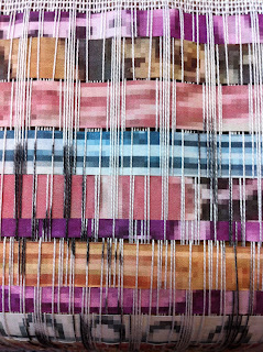


I had a little tutorial as well today about my off the loom weaves and she liked my pieces. She said I should maybe try some paper weaves with my blown up stamp print outs. I have tried this this evening and it's worked quite well. Tomorrow I think I might weave on the loom with my leftover paper strips. Also she said I should do a weave incorporating all the colours I've used in my weaves the past two weeks. I'm not sure about this, as I did seperate colour weaves on purpose to create the look of the stamps themsleves, not a mixture of two or three as that want look like a final stamp, I hope you understand this thought process.


I like this weave above, the colours are good. Its a shame that you cant really see the drawing I did of a franking stamp on the warp before I weaved but it didnt help that it was a black and white threaded up loom.
DAY8
So I went in early yesterday and got a white loom, and did a weave with the leftover paper strips, which experimentation, and I think it looks quite cool actually. The strips were different thicknesses and this has worked so I'm pleased. See the photos below.


I then did a weave including all the different colours from the previous weaves I have done, it looks okay, but its kinda a mess of all different colours, and like I was worried of it happening it doesnt look like a stamp, just random colours put together, but at least I tired it!


Exciting we take the weaves off the loom today, so get to see what they actually look like as pieces of fabric today wooo!!!
printCAD
I have finally printed out my CAD design prints I did during my print rotation. I have never used photoshop in my life before other then in year 9 for about a week, so I was a novice, so they arent the best designs, but I worked really hard on them, so I am pleased with them.


The above photo is my favourite print design


Looking at them now they look a lot like my prints I did the print workshop, the layering of the different patterens and designs. I have used a mixture of my drawings and stamps from the actual collections, and these work really well also! So I am pleased with them!
Subscribe to:
Posts (Atom)